Overview
Before & After
Before
After completing email, identity, and phone verification, users were directed straight to the app's home screen. The home screen was the only gateway to explore and understand how the app worked — no guidance, no context, no indication of what to do next.
After
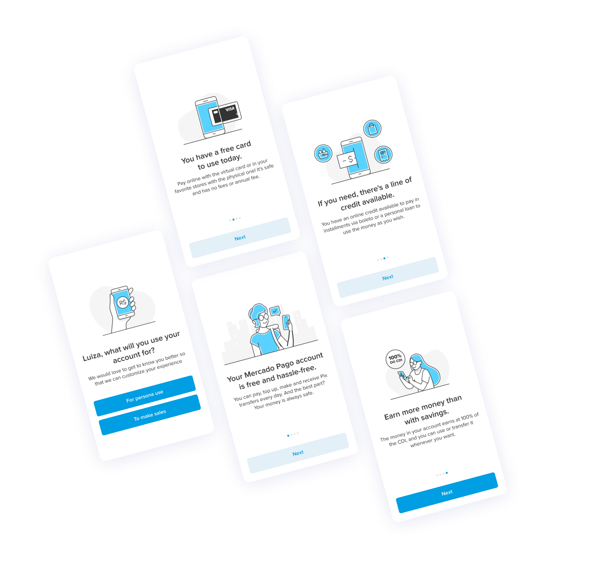
A personalized 3-day onboarding journey. On Day 0, users identified as payers or sellers and entered a tailored 4-screen in-app sequence showcasing the most relevant features. Over Days 1–2, contextual push notifications followed up based on what they had or hadn't done.
Fig 1 — Onboarding flow overview
Context
Date, Team & Role
Mercado Pago is a digital bank operated by Mercado Libre — one of Latin America's leading e-commerce companies. With 48 million unique users, $47.3 billion in total payment volume, and operations across 8 countries, its ambition is to become the primary banking option for people across the region.
In markets like Brazil, where the average person holds 5.2 bank accounts, that's a high bar. The Growth team's role was to find the leverage points that turn sign-ups into active, engaged users.
As the Senior Product Designer on the Growth Tooling team, my mission was to design experiments, tools, and features that improved the user activation journey. I worked alongside a UX Writer, a UX Leader, and a Product Manager, with support from the Research and Marketing teams.
Problem
Things to Solve
Mercado Pago's objective was to become users' primary banking choice. To do that, we first needed to understand what was happening right after sign-up — and the data was sobering. We identified a significant challenge in retaining users post-acquisition and set two primary objectives to address it.
Fig 2 — Day 0 drop-off data that shaped the brief
Process
How We Got There
We started by auditing what we already knew. Through workshop sessions with the team, I helped convert business objectives, roadmap constraints, and technical limitations into concrete research questions: What were the most-used flows between Day 0 and Day 30? Which products showed the highest rate of habitual use? What percentage of new users already had a Mercado Libre e-commerce account? How did early adoption of each feature influence 30-day retention?
The answers came from multiple directions. UX Metrics shared by the Research team revealed a significant gap between how new users understood the app versus experienced ones — confirming that first-time users needed active guidance, not passive navigation. Desk research grounded us further: according to Pixalate, 75% of users abandon an app within 24 hours of downloading it.
Three insights shaped the direction of the solution.
Educate before asking.
Most users stopped returning after just one day. Addressing the first twelve days — especially Day 0 — was critical. Show users what the app can do before expecting a transaction.
Personalize by intent.
Users split into two distinct profiles: those using Mercado Pago as a digital bank, and those managing a business. Without knowing which, we couldn't surface the most relevant features first.
Meet users across days.
Pix key registration, credit card activation, payments, transfers, and deposits were the most-used and most predictive features. A 3-day journey using in-app and push notifications matched the 80/20 drop-off window where Days 0–2 had the highest impact.
Validate cheaply first.
We ran a low-fi concept test with 5 first-time users before investing in high-fidelity design or full rollout — using the A/B test to confirm impact, not to discover the idea.
We designed a 3-day onboarding journey anchored on a clear hypothesis: if we give new users an educational experience that shows them what Mercado Pago can do — matched to their profile — they will be more likely to transact within their first 10 days.
Day 0 began with an in-app profile identification screen. Depending on whether a user was a payer or a seller, they entered a personalized set of up to four screens highlighting the most relevant features. Over Days 1 and 2, contextual push notifications followed up based on which actions they had or hadn't taken. We ran the experience as an A/B test, starting with Brazil — our largest strategic market.
Fig 3 — Before: empty home screen. After: personalized 4-screen onboarding flow.
I worked with the team's UX Writer to develop low-fidelity concepts, then ran a conceptual validation with five first-time Mercado Pago users. Each participant was asked "What is Mercado Pago?" before and after reviewing the onboarding sequence.
Fig 4 — Low-fi concepts tested with 5 first-time users
“
The digital account of Mercado Libre that you can use to make payments and transfers, like a digital wallet.
— User, after onboarding (conceptual validation)
Impact
Results
+6%
increase in user activation
2.2×
higher activation rate vs. control
1
dedicated team created as a result
Our hypothesis was confirmed. Users who experienced the onboarding showed a significant increase in activation compared to those who did not — validating that a guided, personalized entry experience makes a measurable difference.
The results also revealed something important about the opportunity itself. The onboarding experiment was built lean by design, leaving clear room to improve specific use cases, deepen personalization, and smooth the handoff between sign-up and the in-app experience. Once the hypothesis was confirmed, the path forward became obvious to both the team and the company.
Fig 5 — A/B test results: onboarding vs. control group
Learnings
Looking Back
Smooth the seam between sign-up and onboarding.
When we designed the onboarding, we saw how it could be integrated more deeply into the sign-up flow — adding visual polish and proactive account setup steps like credit card activation. What began as a lean experiment opened a clearer picture of what a seamless end-to-end experience could look like.
Understand why users drop before trying to fix it.
The Day 0 drop-off rate pointed to a problem, but not a reason. Other teams faced their own pain points in the same funnel. Getting the Research team activated to investigate — and routing findings to the right stakeholders — was essential groundwork that the experiment alone couldn't do.
One onboarding doesn't fit all entry points.
We designed for the most common case, but quickly saw that different entry points required different treatments: users returning after months away, users arriving via a Mercado Libre refund, users under 18. Identifying these groups led directly to the establishment of a dedicated onboarding team — the most tangible structural outcome of this project.